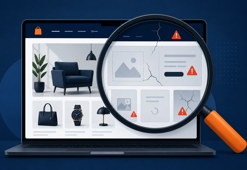
You’re an eCommerce store owner. How well does your site do with mobile users?
“Oh god, another blog post about why I should have a mobile-friendly site,” you’re probably groaning to yourself. We’ll you’re right that the “why”-horse in that conversation was been beaten into the ground several times in 2012, and was quickly joined 6-feet under by its reincarnations each year since. Good news, we’re not here to talk about “why,” but how.
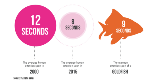 According to a 2015 study by Microsoft, if you’re reading this on a desktop computer, chances are I lost you at that part about the horses (12 seconds on the page). But if you’re on a mobile device, I’ve probably lost you at “oh god” (8 Seconds on the page). The time has come where humans are now living in a world where time is becoming irrelevant to the every-day person because of outrageously diminished attention spans. Days are commonly being measured by the quantity of things that one can accomplish in them, and prioritized by the vehicles available to get things done.
You, the eCommerce store owner, are on the other side of this paradox. Time and efficiency are now more relevant than ever to your business, and with the proverbial sun well beyond the horizon of mobile browsers, your site is expected to be spoon-feeding ungodly amounts of unique and premium information at a pace faster than anything humanity has ever seen.
To prepare yourself for the ugly impatience of humanity, you can always hit the grind with your keyboard and run your site through Google’s awesome mobile friendly validator, or check out some of Google’s awesome checklists, but as experts, we thought we’d give you a couple pointers of our own.
Step 1- Recognize the page’s goal!

The number one purpose of your site might be to make a sale, but each page has an important role in that process. By recognizing the goal of each page and how it contributes to the process of a sale, you can better work to engineer your pages to present a user with clear visuals to help them along and better maintain a shopper’s attention span and engagement. On a mobile site, large buttons with clear and short call to action text will guide a user without overwhelming them.
For example, if your goals are…
- To help a shopper arrive to your store, make sure that a “Get Directions” link is quickly visible and easily clickable.
- To encourage a purchase, present a clear image of the item and make sure you include 2-4 quick selling points with information taken from common questions, and a clear “add to cart” button. Reviews are critical, and will be the second thing a user looks for once they have identified that they are on the correct item!
- For a user to sign up for a newsletter, make sure you are only asking for the least amount of information necessary, and a clear statement of what the user is signing up for.
Step 2 – Make it easy!
Whether they realize it or not, the keyboard and a mouse of a computer give the user a sense of safety when they’re browsing. Tasks on a desktop feel much simpler and can be finished more efficiently via direct input and engagement with site elements. On a mobile device, a user’s fingers must serve as both, and can function as one at a time. Without the standard tools giving them the ability to engage the site as normal, a user’s patience and feeling of control is drastically reduced, bordering non-existent. Working to ensure that key functions on your site are intuitive and easily recognizable to the common shopper will prevent frustration and abandonment.
Some ways to do this:
- Simple, recognizable buttons with clear call to action text will help users find what they’re looking for if the information can’t all be on the same page.
- Make sure that popular functions such as Search, Cart, and category navigation are always visible and tucked to one side or to the top of the browser. Users who recognize how to quickly navigate to safety or another page will be less likely to abandon the site in search of another.

Step 3 – KISS (Keep it Simple, Stupid)
In 2014, Google unveiled its new concept for Material Design, an attempt to set and revolutionize the standard for which sites would be designed, with the idea that each site would be more capable of maintaining its look and feel as a user would move between their devices. Material Design brought a new standard of simplicity by using simple shapes and colors reminiscent of layers of paper to identify and separate buttons, sections of pages, and other site elements. The result was a pivotal switch in how users would come to digest websites at first glance, as well as navigate the pages. Equipping your site with clear and obvious buttons with distinct calls to action not only improves the usability of your site, but also prevents mistakes that might frustrate users.
Keep your site simple:
- Enlarge and define buttons to be obvious, with simple messaging that makes it clear as to what is waiting on the other side of the link.
- Design your site for fingers of all sizes! Small buttons are difficult for sausage fingers to press, and may frustrate users.
- Design your site for eyes of all sizes! Small fonts and text can not only be difficult to read, but give the illusion that there is more text to read through and intimidate users.
Step 3.5 – Speed!
This isn’t a step 4. In terms of its importance, this is more of a step .5, but as with all websites, design and functionality must come first so this critical line item lands on this list right here!
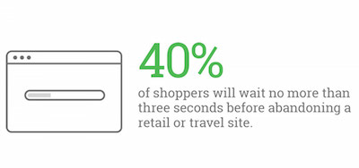
As of December 2015, the average mobile user’s attention span while browsing a webpage was clocked at 8 seconds. What is important to realize here, is that this is less than the duration that a goldfish is capable of keeping a thought. The next most important thing to realize here is that this is 8 seconds with the content of a page fully loaded. According to Google 40% of users will abandon a mobile website if the content has not loaded in less than three seconds,
Some ways to speed up your store:
- Use a CDN – A Content Distribution Network is a series of servers that each store copies of your site, and will activate based on the geographic location of your site’s visitor. (Information has to travel too!) These distribute the load of information and provide much more reliable and prompt access to your site.
- Compress CSS, Javascript, and HTML files that are greater than than 150 bytes using tools such as GZip.
- Remove comments or unneeded characters from your site’s code.
We never said it was easy, but we will say that we’re here to make it easy-er. At Human Element, we’re extremely proud to boast an awesome portfolio of successful eCommerce stores, the majority of which are equipped with responsive sites or mobile-friendly sites. We’ve made friends and rubbed elbows with some pretty awesome folks who help us to pioneer the user experience (shoutouts and love to you, Josh Frank) and make sure that we’re paving the path to success with the right tools and the right data.
Wondering if your site needs an update to be pretty fly on mobile? You can always check out Google’s Mobile Friendly Test site, or you can put your own data to the test in your Google Analytics account by checking out the device segment of your data (we’re pretty sure you’ll be surprised at the volume). We’re here when you’re ready to talk!