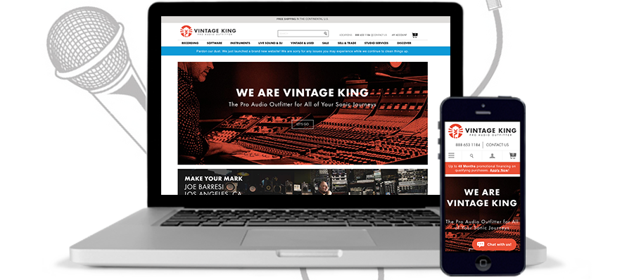
 On February 28th, Vintage King Pro Audio and Human Element partnered to launch a bold and fresh new site that’s fully representative of their status as the country’s premier Pro Audio Outfitter. On top of upgrading from Magento 1.11 to 1.14, this “header to footer” redesign bore the goal of transforming the site into a sleek, modern eCommerce experience that aligns and scales with rapidly evolving user expectations. We had a few primary goals:
- Cleaner Page Architecture
- Persistent, Sharp, Simple Navigation
Cleaner Page Architecture
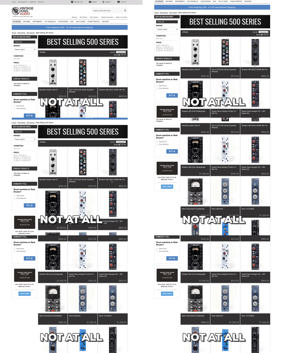
From the homepage to catalog and product detail pages, Vintage King and Human Element agreed on designs that prominently featured the content on the page instead of the design itself. The result is a homepage where content, with beautiful imagery and important messaging, jumps off the screen and speaks directly to the user.This design strategy also manifests itself on catalog pages and product pages by unifying the experience of browsing multiple products with the investigation of finer details. In the side-by-side below, you’ll find the default category view displays products, pricing, and details to mimic the design on product pages.

User experience on these pages is crucial to conversions, and aligning the two layouts has gone a long way toward building familiarity with the site. You can see the utility of the simple design that focuses on imagery, pricing, and the big, shiny, red “Add-to-Cart” button. The mission in all of this is to sell more audio gear, and cleaner pages remove barriers for customers.
Persistent, Sharp, Simple Navigation

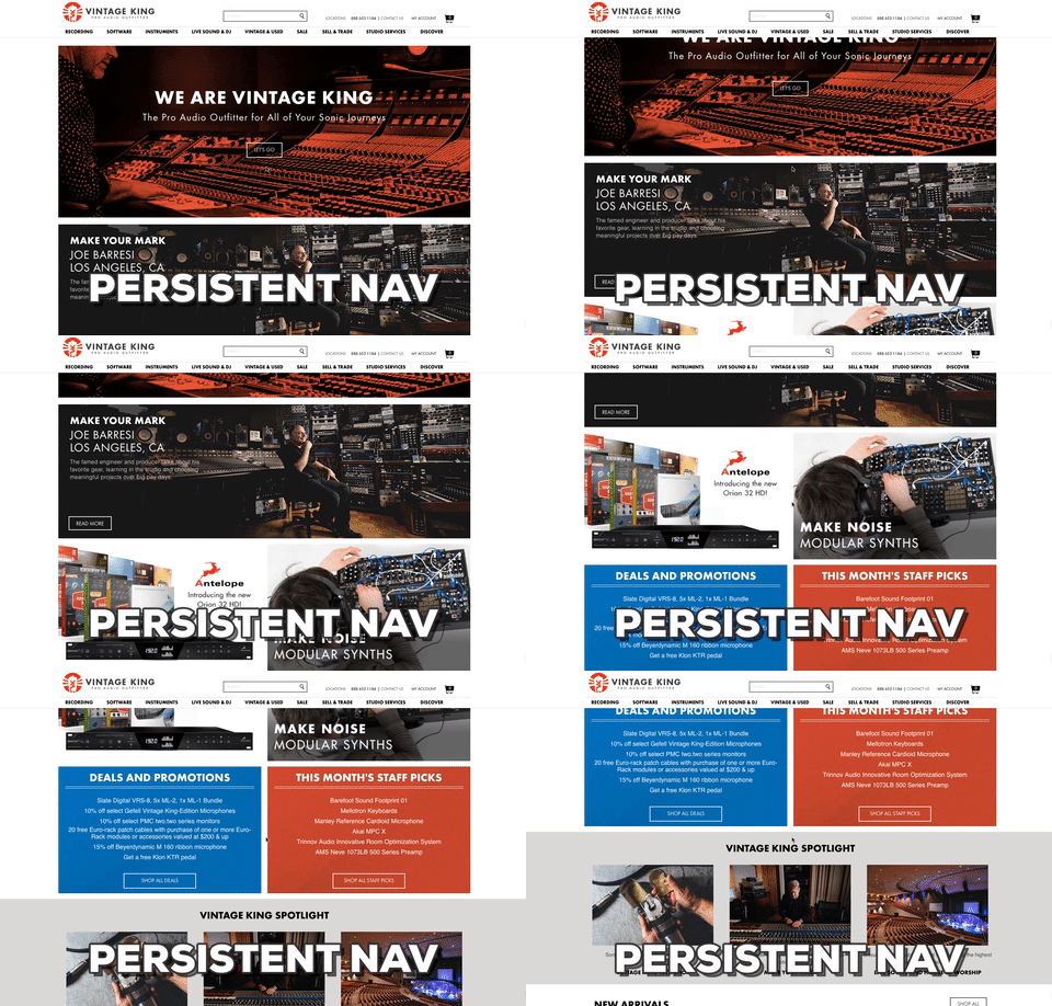
 As buzzwords go, those suffice in describing the new navigation on VintageKing.com. Shoppers have grown accustomed to top navigation as the primary method of browsing e-commerce sites, so it was imperative that this proverbial treasure map was always present and easy-to-use.
This is accomplished through a few key features/functions:
Fixed Header
If you visit vintageking.com and scroll on any page, the top menu and the header will scroll with you. Having the most important links on the site available at any page-depth makes exploring the site much more intuitive. Not only can users see categories at all times, but they can also quickly review their cart, access their account, and search for products. This, in particular, is a major improvement from the previous site where users would lose all of that visibility after one quick scroll.
Monster Dropdown Navigation
There’s something immensely satisfying about clicking on a category and having the dropdown menu fill out the width of the page. This provides layout flexibility for top level categories with tons of space for child categories. Additionally, there is room in the dropdown to display promotions and important messaging pertaining specifically to certain categories. Normal dropdown menus might work for some Magento sites, but the rockstars that use this site will appreciate the way it takes over the page.
Click-to-Expand/Collapse
Staying out of the user’s way was a major focus during planning and design for this Magento store redesign. Part of that means that the menu does not expand and collapse erratically by rolling over different options. Requiring users to click on categories to see additional options ensures that users see only what they want to see and nothing more, giving them total control over their shopping experience. This also scales seamlessly to mobile devices, since interaction with the top navigation is uniformly a tap/click across all screens.
Project Reflections
Like most great constructs of human achievement, VintageKing.com was not upgraded in a day. Careful attention was paid to making sure all of the work, especially custom development, was connected to a larger goal. It can be difficult, when building a site, not to jump at every new feature or improvement in an attempt to make the site as sleek as possible. The fact is that sometimes the best strategy is to wait and see what the data shows in lieu of making intricate customizations that may hurt the site’s adaptability and wildly increase costs. One of the great successes of this project was that there was buy-in to this mindset from all levels of both teams.
Still, in retrospect there are things that both of our teams have looked back on, wishing they were more buttoned-up before launch. Halfway through the testing process, we implemented a shared document where items and their associated statuses could be tracked. This provided Vintage King with a glimpse into our progress, helped me to stay organized, and gave our developers a clear picture of remaining issues that needed to get wrapped up. The team at Vintage King has a wealth of tech-savvy talent that played a crucial part in synchronizing our work streams. This was probably the single most important reason why having a shared, working development document worked so well for this project. They were able to speak directly to the root of any issues that they found during testing, and could support their findings with related business logic. Their team recognized the scope of this project, and trusted our team to deliver work that supported their most important goals.
This site upgrade and redesign has been the largest-scale project we’ve taken on since moving to Magento in 2012. Upgrading through three dot versions and launching a completely redesigned brand simultaneously was no small feat. This ambitious transition will push us headlong into the next phase of our company’s growth.
Vintage King Team
This was a major overhaul in every respect, and it would not have turned out nearly as gorgeous without the most sincere, honest work on the part of both the Vintage King and Human Element teams. If you’re ever in a Vintage King neighborhood, Detroit, L.A., or Nashville, drop in, say hello, and take a look around at their gear that’s lauded by industry pros. If you’re anywhere else in the world, you’ll need to visit their new site and see why we’re all so obsessed.


