In the 20+ years that Human Element has been in existence, we haven’t made a fundamental change to our brand identity. A couple of years ago, we made slight updates to our color palette and brand font, just as a light refresh. But the logo itself remained the same as it was when we first introduced it.
Late last year, we decided it was time for a change.
Why Change Now?
We wanted to refresh the brand to reflect the ways in which we’ve grown. We still love our name, Human Element, and didn’t want that to change. We still strongly believe that the human experience remains at the heart of what we deliver and how we interact with our clients, partners, and the community at large.
And with the advent of 100% remote work during the Covid pandemic and now with a heavy focus on AI in our industry, we maintain that the most vital connection is the human one. It was and is important to keep that as part of our brand.
How Did We Do It?
We got our leadership team in a room (IRL, face-to-face) and we talked through what was working for the current brand and what wasn’t. We reviewed the brand identities of some of our competitors and talked about what we liked and didn’t like. We then each wrote down what ideas we had for what we wanted our brand to represent and sound like.
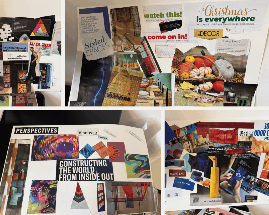
We even did a hands-on exercise, arts & crafts style, sorting through magazines, cutting and pasting to create moodboards of things that resonated with us: photos, colors, typography, textures, words. The common themes were warm colors, mixed fonts, and approachable yet tech-focused design. All this informed where we landed today.
For messaging, including writing a new tagline, we looked at what our clients told us in a recent customer satisfaction survey. We used the common themes there to come up with a handful of tagline options to review.
We turned all that feedback over to our graphic designer, and she designed several iterations of new logos, color palettes, and styling standards for us to review. After a couple of meetings and some tweaks, we landed on our new design and tagline.
Out With the Old…
The previous Human Element logo was tech-focused; it contained coding brackets as its core style element (the middle “< >”). And while we began as a team of developers writing code for eCommerce websites, the scope of our services expanded a lot over the years. Development is still a large part of our business, but we also provide expert strategy, design, digital marketing, and analytics. We wanted our new logo to reflect that.

…In With the New
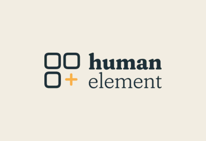
Now, the logo takes the sole focus off of development. An icon of three rounded squares with an orange plus sign suggests systems, growth, and interconnection. The boldface “human” suggests our focus on that word, and “element” can be seen as a building block of something larger.
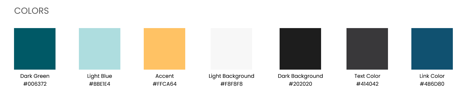
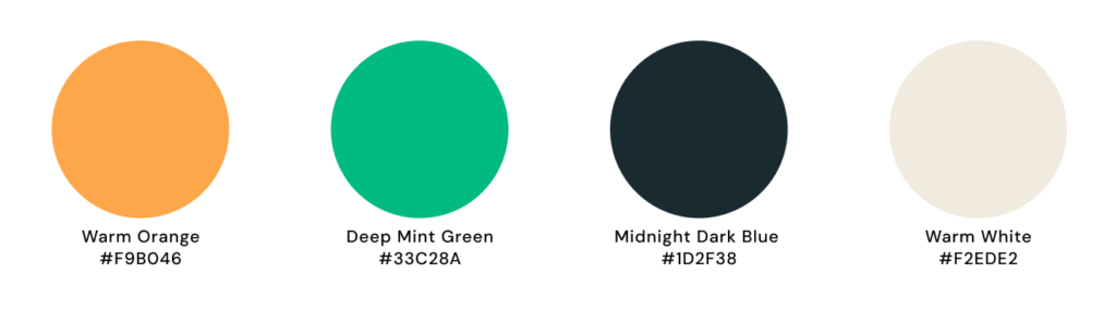
Likewise, the color palette moved from cooler tones to warmer ones, and the fonts are a mix of serif and sans serif, creating a more approachable feel.
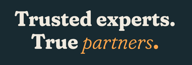
And not to toot our own horn too much, but the common thread we saw in client feedback is that they value us as an extension of their own teams. We couldn’t ask for a better compliment. Also, we feel that way too. Really understanding our clients’ businesses and their motivations is what leads us to delivering great strategies and solutions to help make them successful. Our new tagline speaks to that and our deep experience of over 20 years as an agency.
While our look has evolved, the things that matter most haven’t changed: our people, our passion for solving complex eCommerce challenges, and our commitment to putting the human element at the center of everything we do.