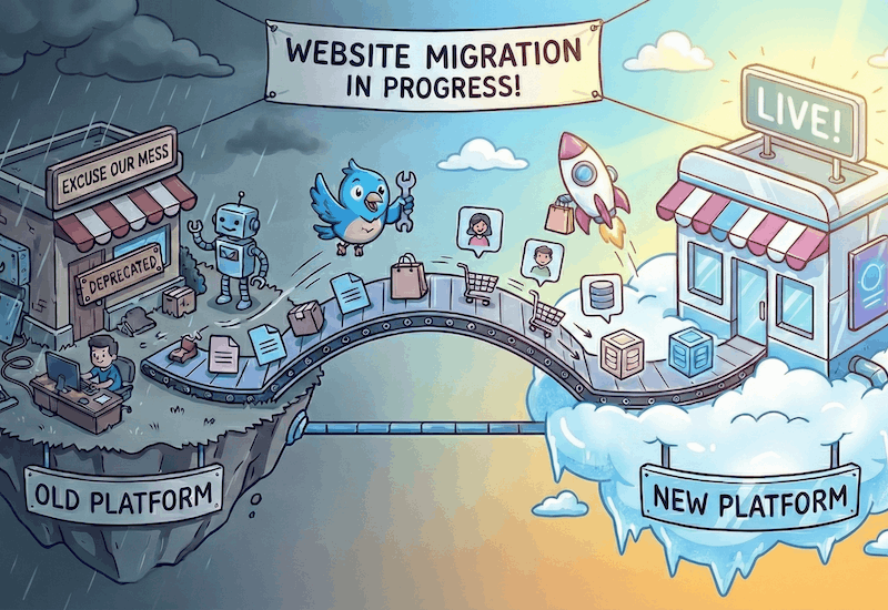
This is Part 2 of Josh Frank’s exciting series of blogs on A/B Testing. Read Part 1 Why You’re Crazy Not to A/B Test Your Magento Store for a little bit of background.
 So. What should I be A/B Testing?
The easy thing would be to say, “You should test everything, all the time!”, but in practice, A/B testing everything is unrealistic, at least at first. You’ll want to test areas where you have the most to gain from positive changes.
Here are some of the areas on your site where I would bet that your website is losing some conversions, and could be improved with A/B testing. I’m serious, go ahead and place your bets in the comments section.
Test removing your home page rotating banners & sliders
Great for keeping everyone happy, except for your conversion rates!
Now, I know what you’re thinking: Oh No He Didn’t!
But, I DID!
I get it. Your home page is precious real estate, and everyone wants a piece. Your vendors want their products there, your boss wants the highest profit items there, and you just want to keep the peace. So, what’s the perfect solution? The rotating banner.
I’ve been there, and the idea of being able to keep everyone happy by having everything on the home page and “above the fold” is tempting, but it can actually be hurting your conversion rates, and that won’t make anyone happy.
Here are a few main reasons that when it comes to usability, the rotating banner is often a poor choice for displaying home page content.
1.) Banner Blindness
Banner Blindness is a usability pitfall that occurs when important information is ignored by visitors, because the delivery method, in this case, rotating banners, is treated as an advertisement.
2.) Messages Move too Quickly
Most banner features slide to new messages automatically, and it’s usually way too quick for the average reader. Even when a visitor pays attention enough to read the banner, most of them move too quickly and will skip to the next message. This is annoying.
3.) Too Many Banner Messages
Trying to present 5-8 messages is less effective than one clear message. Have you ever heard the phrase, “If everything is a priority, nothing is a priority.”? Yea, it’s like that for your home page too.
I’m not suggesting that rotating banners are never the right way to display information, and always hurt conversion rates. I’m just saying that if you don’t A/B test it, you’ll never know.
Other Optimization Ideas for A/B Testing
Now, on to some hopefully less controversial conversion rate optimization ideas!
1.) Increase the size of your product images
If pictures are worth a thousand words, then large, high-resolution product photos are worth thousands of dollars in improved conversions.
2.) Highlight your Sales and Specials Categories
People like sales. Actually, they love them. Need proof? Remember that time JC Penney decided that people didn’t need sales, and we’d all be cool with just everyday low prices? Yea, it was a bold strategy, but it flopped because it went against human psychology. People love to feel like they are winning, and that they deserve the things they buy, because, “Hey, I found it on sale!”
Another idea is to try testing a different background color for your sale category to drive more traffic (and more revenue) for your store.
3.) Test Call to Action Verbiage
One of the easiest tests to run is to find out what call to action verbiage converts at the highest levels. For example, maybe you have a lead generation form on your site. What call to action will get your customer to fill out that form? “Contact Us”? “Get a Free Quote”? “Fill Out this Form so We Can Call You!” Test some ideas and find out if you gain conversions by changing some verbiage.
Have other ideas for A/B Testing? Let us know in the comments!